


Science with Soul: Evolving the WashU Medicine Brand
WashU Medicine physicians and researchers deliver exceptional education and care across our region’s healthcare institutions.
They provide specialized care at St. Louis Children’s Hospital, conduct groundbreaking research at Siteman Cancer Center, perform critical interventions at Barnes-Jewish Hospital, offer routine wellness check-ups at regional clinics, and and train future medical leaders who will one day become pioneers in their fields.
So when they approached Atomicdust, we were excited to help one of the nation’s leading academic medical institutions develop a brand system that would honor the school’s prestige in St. Louis while standing distinctively in the healthcare landscape.
Their work saves lives; our work would help tell their story.
A moment of possibility—and a little pressure.
It started with Washington University’s rebrand, which the school was rolling out right as we were getting started—and included a subtle but significant shift toward the abbreviated “WashU.” The team at WashU Medicine was tasked with evolving its identity. What could have been a simple update became an opportunity.
With numerous sub-brands under one umbrella, WashU Medicine needed a cohesive system—one that would complement the University’s new direction while differentiating itself from other top-tier medical institutions.
The university rebrand provided the springboard for a genuine transformation: a chance to articulate WashU Medicine’s mission, scale and impact more powerfully than ever.
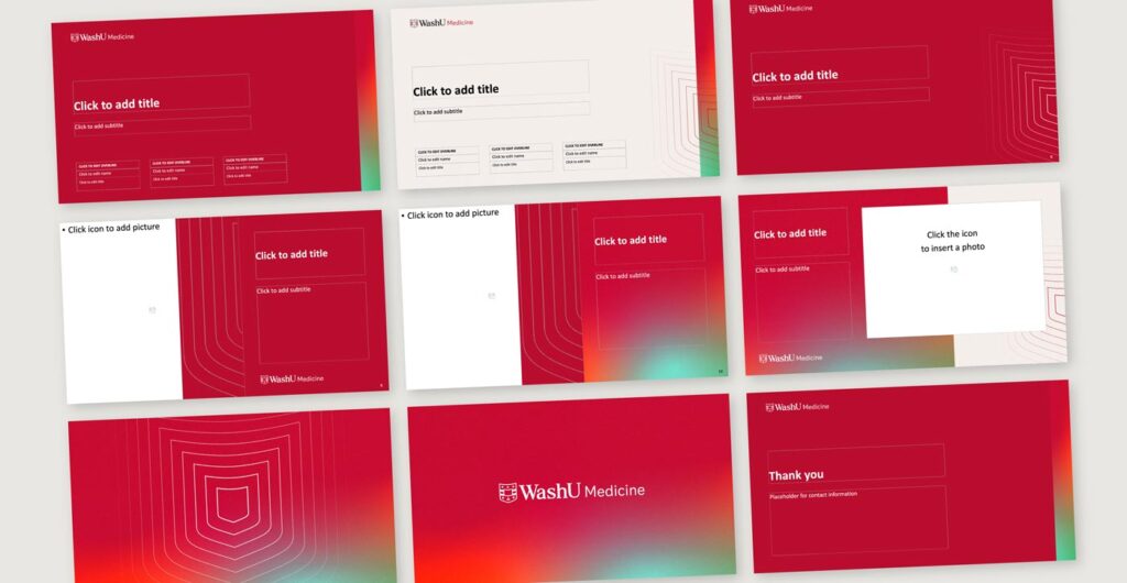
 Above: Early explorations of the WashU Medicine brand.
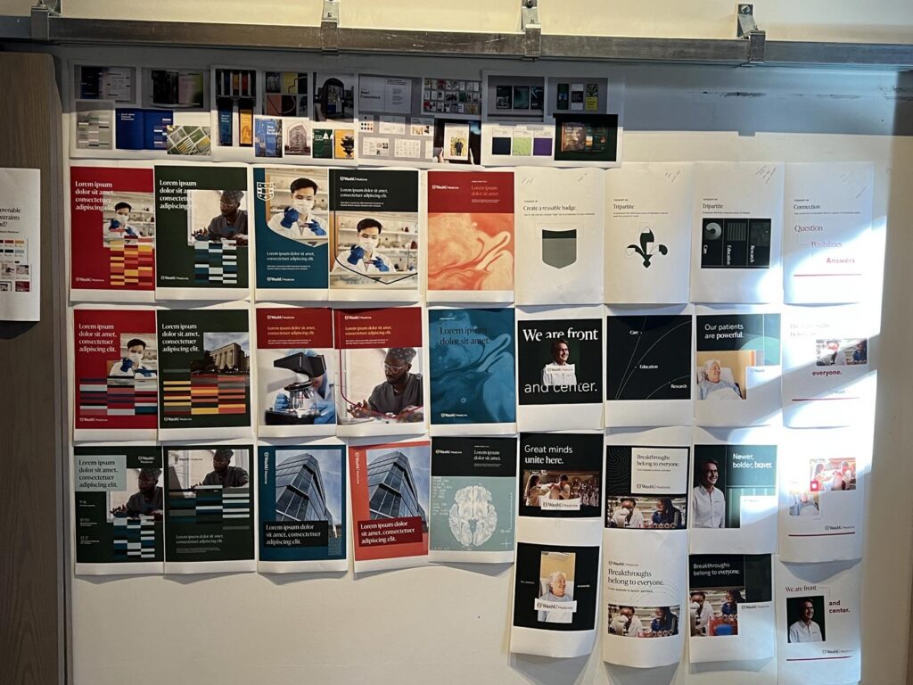 Above: Early explorations of the brand identity hang in the Atomicdust office for the team to review and critique.
But the clock was ticking, because medicine waits for no one. While WashU Medicine’s physicians were advancing treatments and researchers were pursuing breakthroughs, their brand needed to evolve in parallel.
A three-dimensional mission.
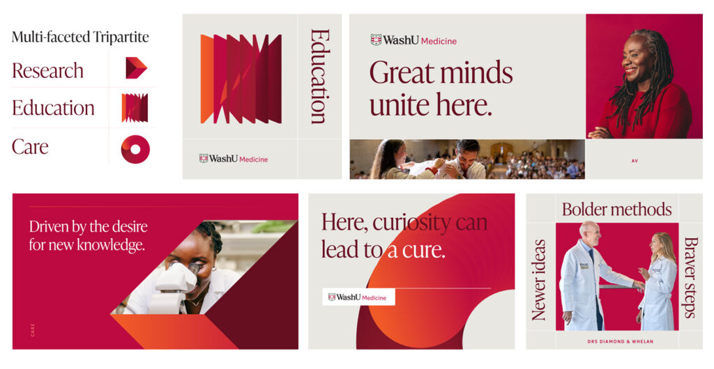
Medicine is complex. It balances scientific precision with human connection, established protocols with innovative discovery. WashU Medicine’s organizational structure mirrors this intricate balance through its interconnected tripartite mission.
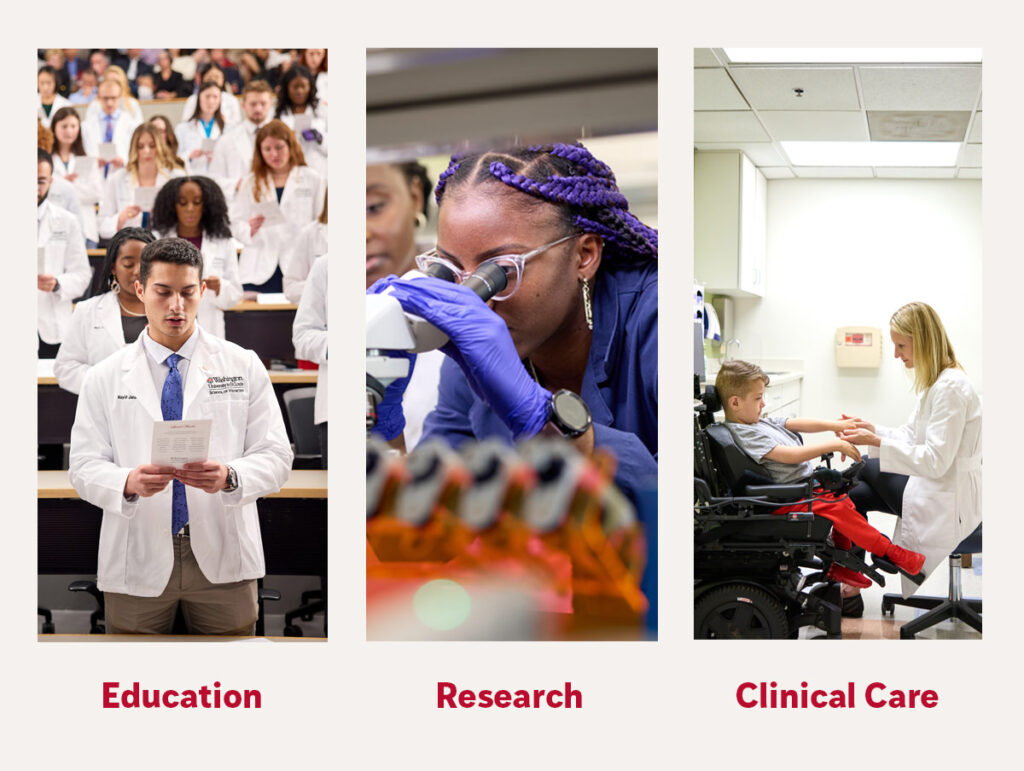
The ‘tripartite’ structure—meaning three connected parts working together—spans education, research and clinical care. Each pillar addresses different audiences with distinct priorities, but it’s the collaboration across all three that creates WashU Medicine’s true impact.
This complexity presented a fundamental question: How do you craft a brand that communicates with authority to medical professionals, warmth to patients, inspiration to students and assurance to donors—without sacrificing consistency or diluting impact?
We weren’t sure of the answer. At least not yet.
To find the balance, we first needed to understand what everyone else was saying.
Breaking through medical monotony.
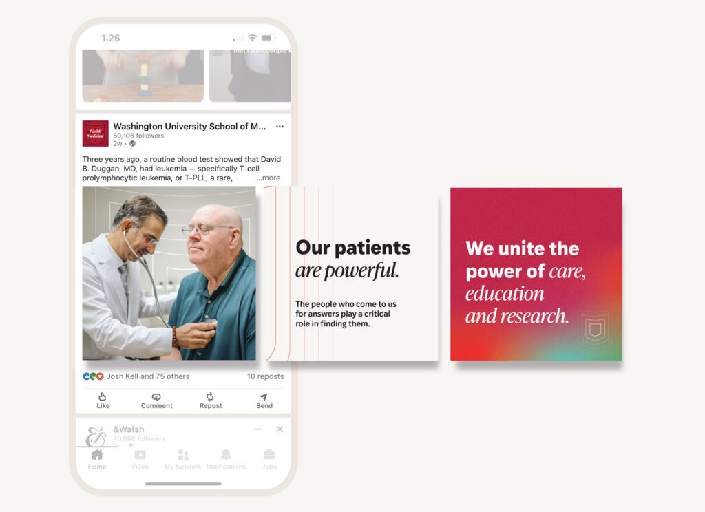
Our competitive analysis revealed a sea of sameness—institutions relying on identical language about “excellence,” “innovation,” and “patient-centered care.” Everyone was “redefining” healthcare. WashU Medicine needed to break through with a voice that sounded human, not hospital.
We developed a multidimensional personality with five key attributes:
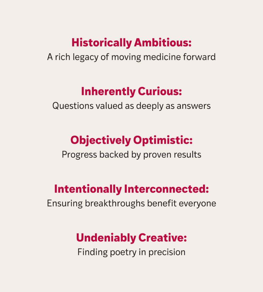
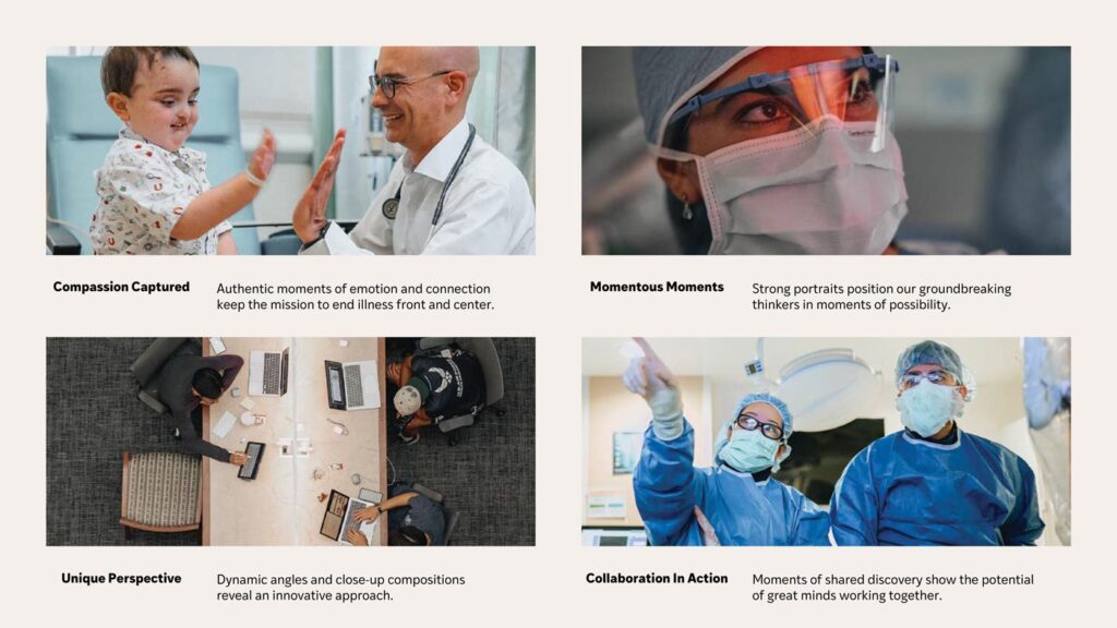
Leading with empathy.
With a voice now top of mind, we set out to develop the language that would define who WashU Medicine is and why it matters—not marketing messaging, but a unifying story that speaks to broader impact.
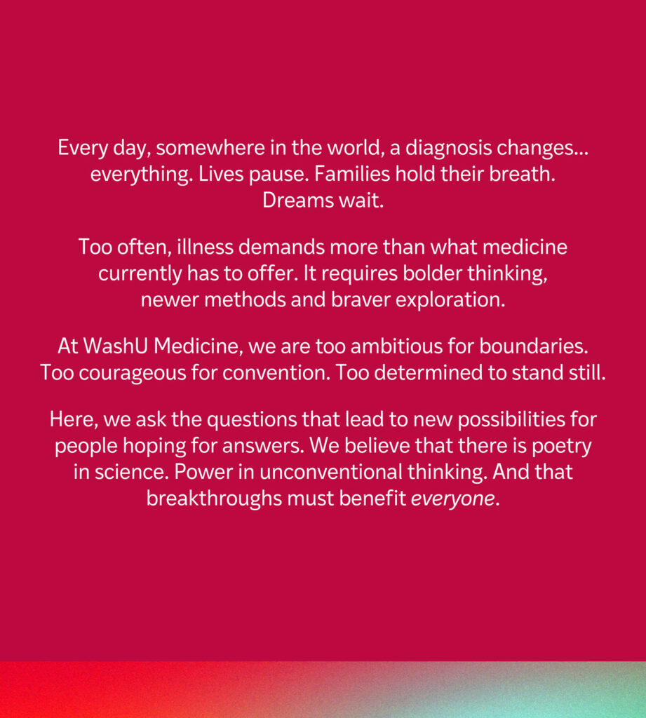
By starting with human vulnerability instead of achievements, our narrative became a compass that blends heart with mind, showcases our three-part mission, and unites diverse teams around a common purpose.
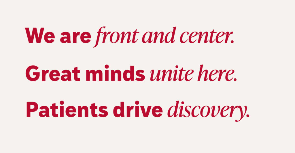
Next: crisp, clear differentiators that would set WashU Medicine apart in a crowded field. These aren’t just marketing claims—they’re the articulation of genuine strengths that make WashU Medicine unique:
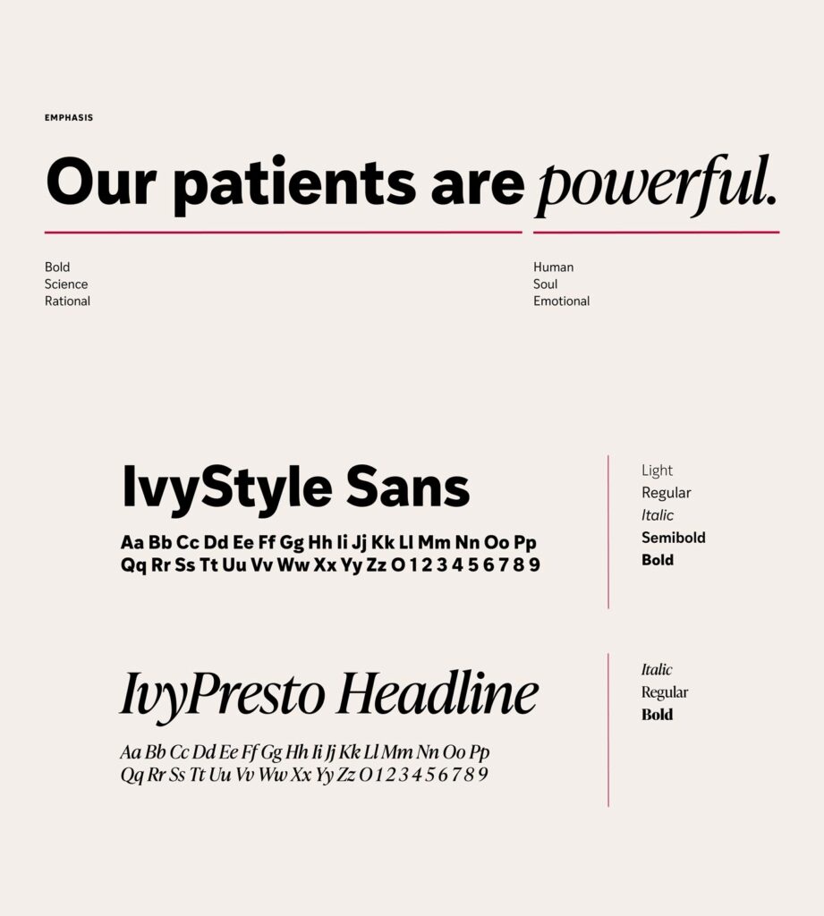
We took every opportunity to build meaning. Even using the typography itself became an extension of the message—mixing bold, modern sans serif with refined serif italics to create visual tension mirroring WashU Medicine’s blend of innovation and academic heritage.
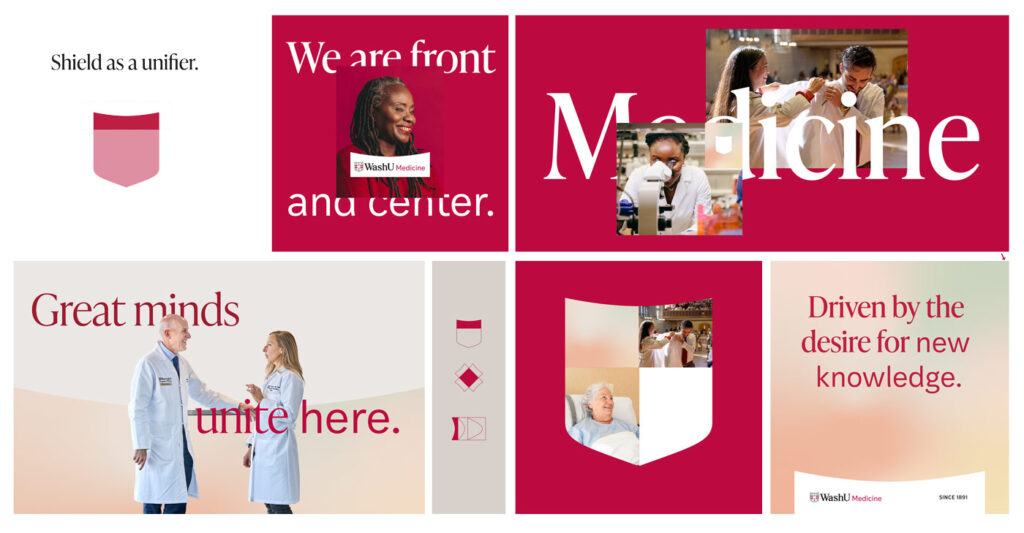
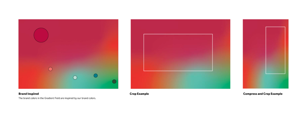
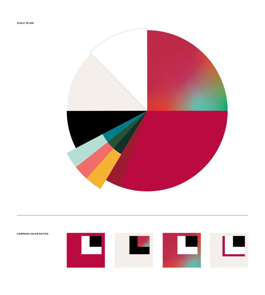
Gradient fields and radiant shields.
Messaging was in a solid place. Now we needed visuals that would illustrate the brand promise, appeal to several different audiences, work across countless mediums, unite the sub-brands and boldly stand out in the monotonous world of academic medical institution branding.
So we started translating our narrative into visuals.

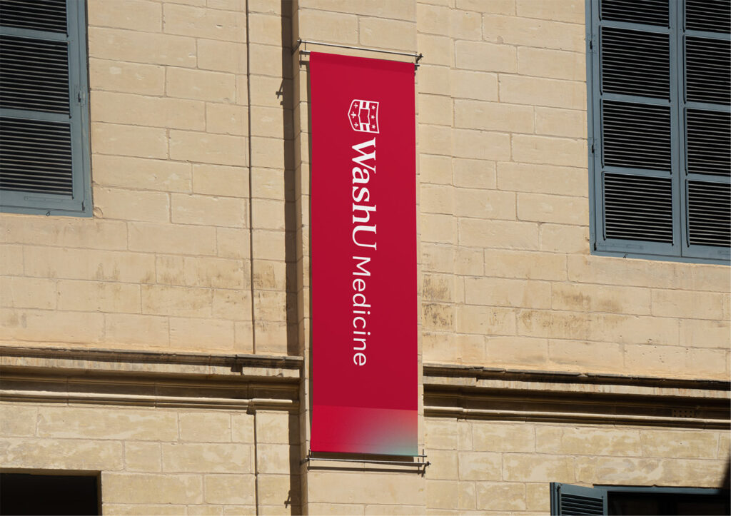
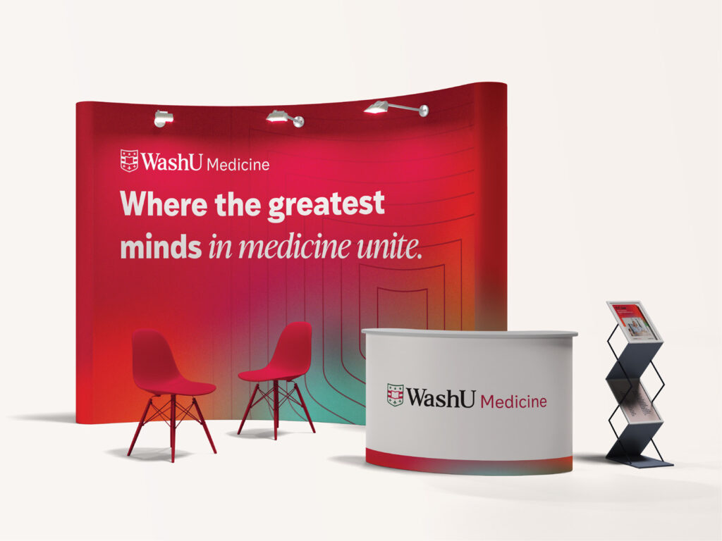
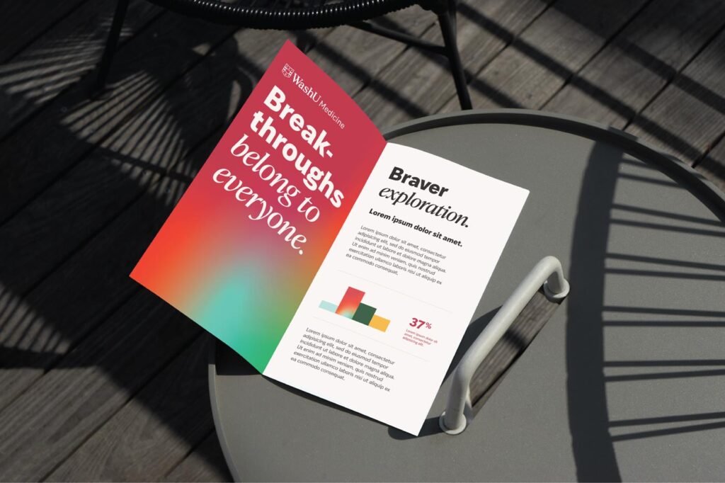
Our gradient system—anchored in the signature WashU red and flowing outward through brighter hues—does more than please the eye. It visualizes how disciplines merge, ideas evolve and possibilities expand.
The traditional shield posed a challenge: respected for its heritage but often viewed as conventional. Rather than abandoning or deconstructing it, we amplified its energy through rippling patterns that show how WashU Medicine’s impact radiates outward.
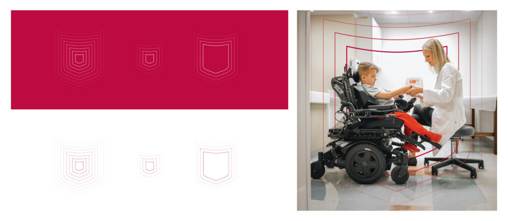
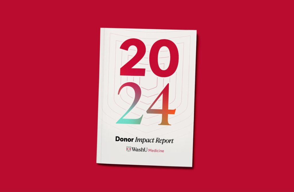
The visual metaphor captures how innovations at WashU Medicine create waves of progress throughout the entire field of medicine—and how every individual within the institution has the power to make a difference.
Designed for everyone.
You can have a beautiful brand—but if it can’t be implemented consistently, it isn’t truly successful.
Within WashU Medicine, there are marketing departments, administrative staff, fundraising teams, researchers and more who would need to use these brand elements, often without design expertise. From social media templates to research presentation templates, every asset was designed to maintain brand integrity while being simple enough for non-designers to use confidently.
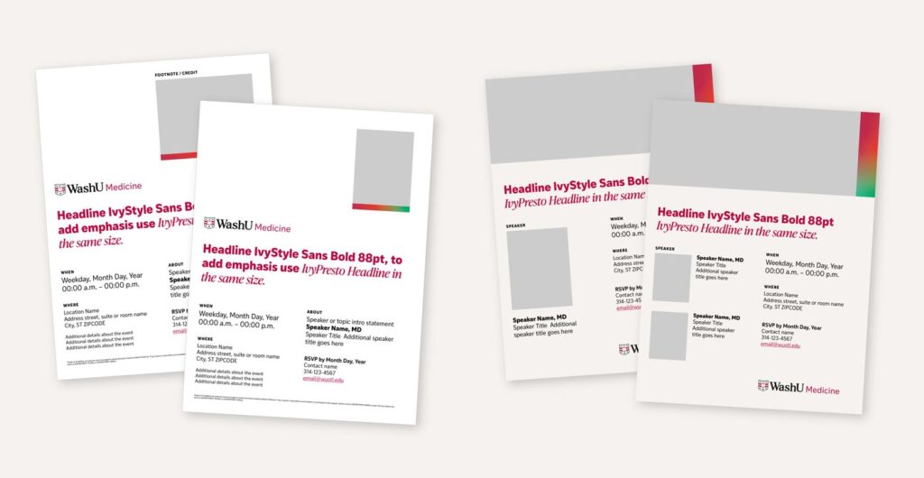
We created a system designed for all the hands involved. Flexible components maintain integrity even when recombined. Clear guidelines explain not just the how but the why. Templates are easily adapted for different contexts.
The goal wasn’t just consistency—it was empowerment. We wanted everyone from marketing professionals to research assistants to feel confident using the brand.
An incredibly comprehensive brand guidelines document delves into both the emotional depth and practical applications of the language and design, ensuring the WashU Medicine brand will remain cohesive while giving teams the freedom to effectively address their unique audiences.
A living system.
As the launch approached, the pressure mounted. With stakeholders across the institution anxiously awaiting the reveal, our teams worked in close collaboration to refine every element, every message, every visual touchpoint—ensuring the brand would resonate from day one.
The brand system balances flexibility with precision, allowing WashU Medicine to stand out both in the university and medical landscapes.
As it’s rolled out, audiences have seen a cohesive system that expresses both scientific excellence and human compassion—a brand that works as brilliantly as the institution it represents.

Branding,Our Work,St. Louis