Big Cartel launched in 2005 as a low-cost, easily customisable ecommerce platform specifically aimed at artists and other creatives. In the two decades since, the platform has quietly revolutionised what it is to be an independent maker, powering more than $2.5 billion in sales from ceramicists, jewellery designers, illustrators, and the occasional medieval tapestry revivalist.
But as the marketplace for, er, online marketplaces has become increasingly crowded, Big Cartel started to face competition from other slick services looking to court that same creator economy. As such, Big Cartel needed to reassert itself – a clearer, more ownable voice was required, and duly delivered by How & How.
The London- and LA-based agency was tasked with giving the brand a visual and verbal overhaul that could reconnect with its maker-first spirit while bringing it meaningfully into the present.
The new identity leans unapologetically into the independent ethos that unites Big Cartel as a brand with its users: the look and feel delights in being a bit rough around the edges, but always feels self-aware, energetic, and just the right kind of scrappy.
How & How has said that changing the logo was a no-go in the initial client brief, a point that the agency managed to quash – and rightly so. The former logo, known as ‘Fletch’, was a sharp chevron, vaguely reminiscent of arrow feathers or perhaps a stylised badge. It wasn’t terrible, but it could feel a little severe and corporate for a platform rooted in maker culture.


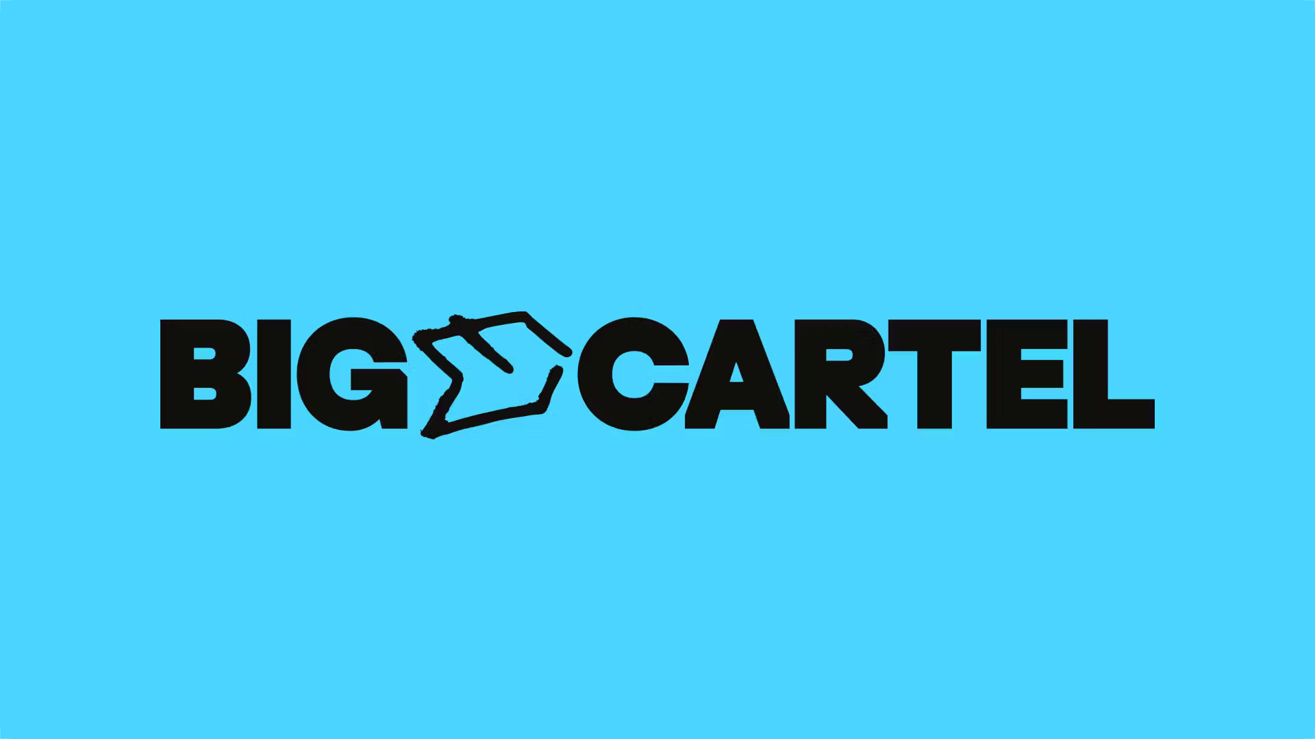
The new solution is clever without being precious: a hand-drawn glyph that sits between the words ‘Big’ and ‘Cartel’, offering a conceptual bridge between structure and spontaneity. Crucially, this new glyph is flexible thanks to a series of sketchy, expressive alternates that offer modulating riffs on the idea.
The new wordmark – set in a customised cut of ES Replan Variform, an idiosyncratic variable font by Swiss foundry Extraset – is another smart move. Where the previous branding saw the words ‘Big’ and ‘Cartel’ fused into a single, slightly awkward shape, How & How opted to separate the two, instantly making the whole thing more legible, ownable and confident.
The lettering is chunky, geometric, and a wee bit off-kilter; the wordmark seems like a brilliant but subtle summation of Big Cartel’s remit as catering for makers that operate slightly outside of standard corporate retail channels.
The squared-off legs of the A and R and the peculiar spur on the G give the type a sort of artisanal yet counterculture-leaning feel without slipping into gimmickry. Meanwhile the weirdness of the R’s squared leg and its introduction of a subtle kerning hiccup between R and T once again leans into that gently erratic yet firmly established vibe: in the context of the broader identity, the quirks feel deliberate, and in keeping with the anti-perfection stance of the platform.
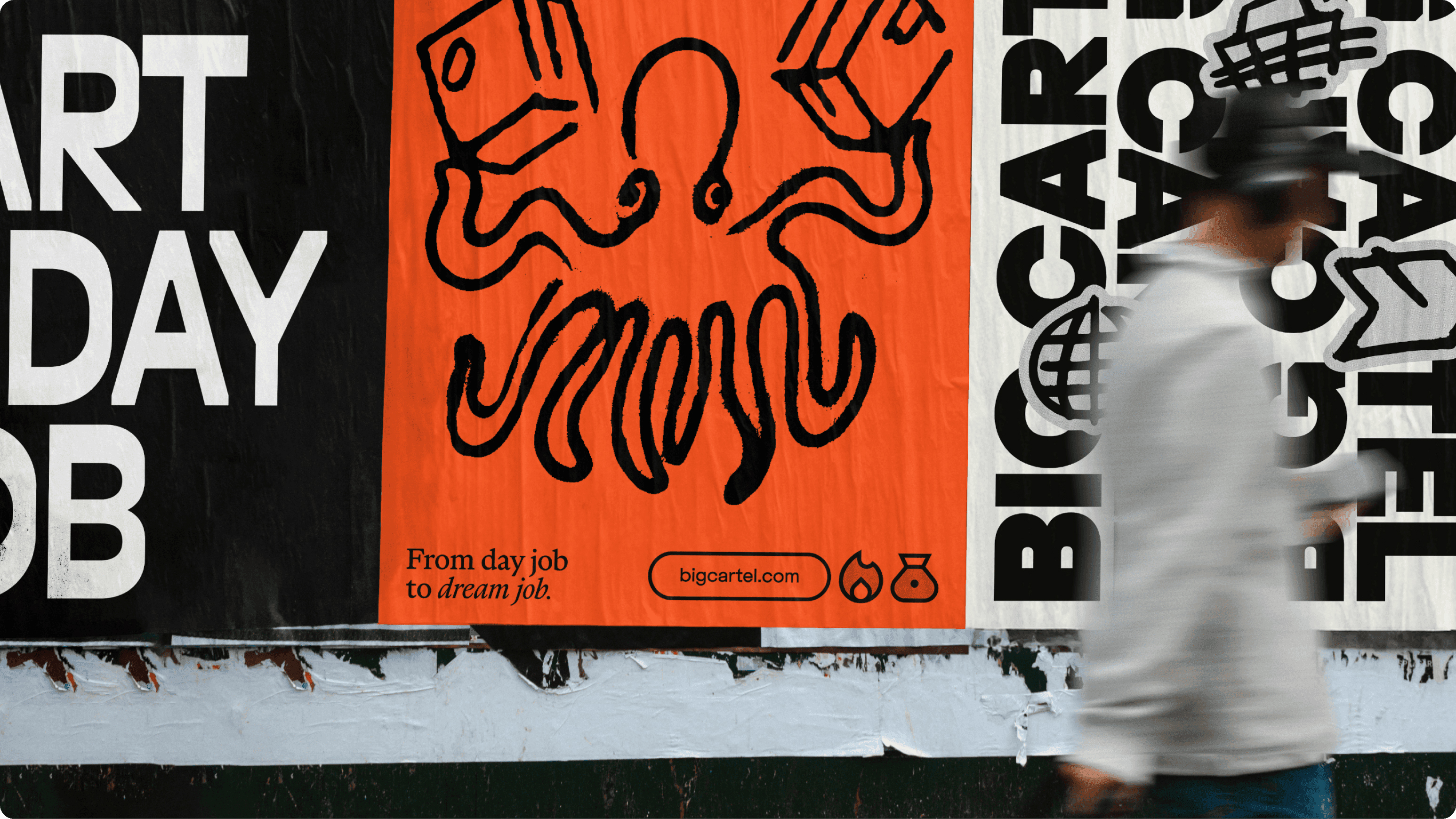
Thanks to the flexibility and multifarious possibilities that ES Replan Variform offers as a variable font, it’s found its way into headlines, subheadings and other applications across Big Cartel’s new branding, yet manages to look nicely different from the main wordmark – more pronounced contrasts, elongated forms, stretched upwards rather than chunkily outwards. Elsewhere, How & How chose fonts including Marist by another Swiss foundry, Dinamo, which describes it as a ‘warm, reader-friendly font with prominent serifs and wide uppercase proportions that take their time’.
The balance of the two fonts means that the angular swagger of Replan doesn’t feel daft or overtly trying-too-hard; tempered by the bookishness of Marist, there’s a satisfying resolution between an aesthetics that’s reaching for punk and one that strives for the poetic. Across the system things hang together thanks to How & How’s disciplined handling of this balance: type manages to be expressive, but never messy.

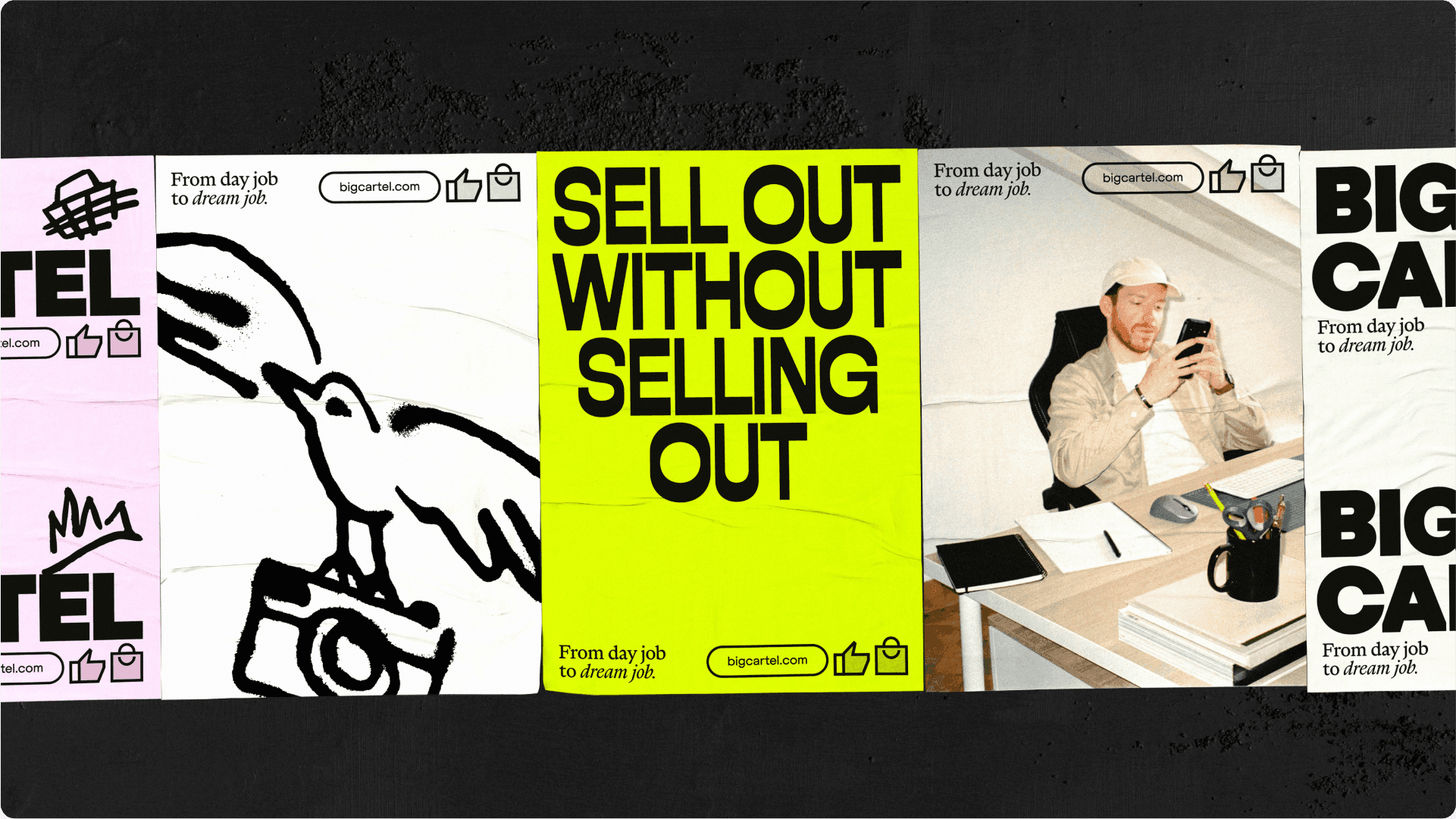
The colour palette is likewise both grounded and lively: neutral foundations of cream, black and stippled grey provide canvas-like calm, while accents of acid green, rich burgundy and electric blue add dynamic little flourishes where they’re needed. This is a palette designed to scale: it can be minimal and calming where more professionalism is required; and go harder, more joyful and playful and shouty in applications that need more of an edge such as campaign visuals.


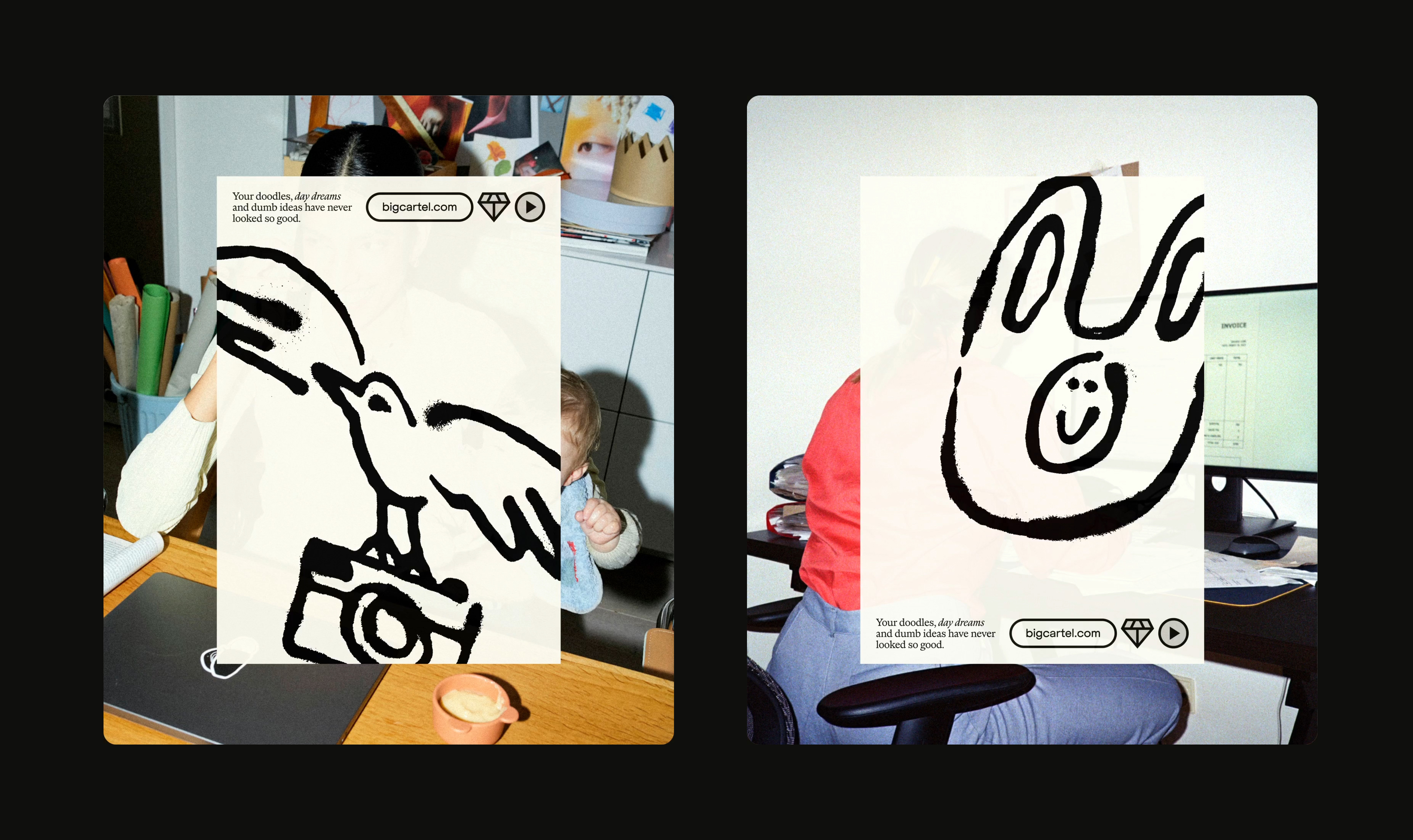
I love the new suite of illustrations by Eilidh Reid, who created a raft of loosely drawn yet punchy graphics that could be seen to recall the energy of a maker’s sketchbook. These are used throughout the system to perform various different functions – decorative elements, occasionally alternate logos, and sometimes simply embellishments for certain layouts. These illustrative graphics are supported by zine-like risograph textures, adding a nice air of tactility despite the brand being pretty much purely digital.
If there was anything I’m not too sure about here, it’s some of the copy – at times, it feels a bit ‘lean in’ – ‘Stop dreaming. Start doing’, for instance, or ‘Sell your stuff, not your soul’, which is vaguely confusing considering how most people use Big Cartel. The humour can fall flat occasionally (if humour was the intention, indeed, maybe I’m just reading it wrong) and feel slightly too bro-ish for comfort.
Taking certain aspects as discrete entities, you could argue that things are almost chaotic – sketchy graphics, endless possibilities in terms of both logo and variations on typography. But in this identity, all that could go off the rails is gently tethered by its foundational structural logic, and some superbly considered use of negative and/or white space.
I’d imagine that working with clients like Big Cartel – established and recognisable, but perhaps misunderstood; digital-only, but catering for all that isn’t – could easily make a design team go too nuts in terms of brash attempts to be ‘arty’. Or on the flipside, it could go in the other direction, fixing both eyes firmly on the more sensible stuff that would guarantee approval from the boardroom money contingent. But here, How & How has done neither, instead creating a consistent, fun brand that’s underpinned by a sense of both freedom – the intangible magic of making – and clarity.


