

An color-washed innovation in handcrafted lettering for commerce
During my earlier years, I got a grant from the National Endowment for the Arts, in funding a journey, a type designer’s odyssey—my so-called “Alphabet Odyssey,” to meet, talk and share with the greats in type design, fine printing, paper making, binding, letterpress, stone carving, engraving and early digital font design development. This trip, which I built in a run from London, spread out to the suburbs, Oxford, Cambridge, Dorset—then on to Paris, Salzburg, Austria, Bremgarten bei Bern, Switzerland, Frankfurt, Darmstadt, Germany, Moscow and Tallinn, Russia. I brought work to share, presentations and booklets, hand drawn exemplars, spent time at the working studios, talked design, the wisdom of letters and alphabetic structure for font design.
I talked to the Matrix of calligraphy,
illustration and illumination,
Heather Child.
Pen entrepreneur,
HisNibs proprietor,
Philip Poole;
Scribe to the Queen,
Donald Jackson;
Islamic contemporary calligrapher,
Issam Al-Said;
Master stone cutter,
David Kindersley;
Rampant Lion’s Pressman and type designers,
William and Sebastian Carter;
Legendary engraver
Reynolds Stone;
Type Designers,
Herman and Gudrun Zapf;
Director of the Klingspor Museum,
Hans Halbey;
Book designer, calligrapher and publisher,
Friedrich Neugebauer;
Type Designer Extraordinaire,
Adrian Frutiger;
Moscow font master,
Maxim Zhukov;
Font educator,
Leonid Pronenko; and
Tallinn designer and typographic legend,
Villu Toots.
The culmination of these discussions, encampments and presentations was a paper presented in Moscow, which was evolved in-transit for another typographic summit in Tallinn, Estonia on American design, typography, and the book arts. Which came out in an overview reference on American designers, ranging from meetings with Herb Lubalin, Milton Glaser, Jeanyee Wong, Paul Standard, Alice Koeth, Tony DeSpigna, Tom Carnase—and later, out to talks and presentations
to typographic specialists like Ed Benguiat.
Obviously, a deep engagement, it was profound, and a wide-ranging exposure for my journey, and what this unearthed—as a seed—for me was the entire gamut of alphabetic arts as a lustration, a shining—even as a purificatory extrapolation of thought—from the sensing and creative mind, in crafting its perceptive interpretation travels to the heart, held in the torso, swung with the dance of the legs, the arms move the wrist, towards the impulses of fist and fingertips as a touch-based illustration of thought, language spilling into the page,
the rhythmic vitality of the breath of an idea.
The ch’i of flow.
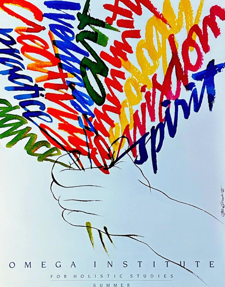
Like this hand-drawn, color-washed
impression of the poetic instinct—“the unsayable said:” 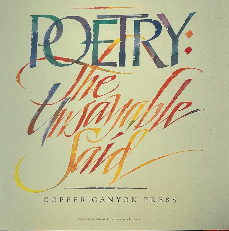
It was after this exploration that I began to mix things up, working on the concept of the illustration of language, literally, as an illustration. I’d learned medieval methods of making color—ground pigments and egg yolk—at the Imperial College in South Kensington, as well as powdered minerals and gum arabic or carrageenan. Then I moved to watercolor pigments, mixed on a glass palette and reapplied to an aqueous drawing, then brush-washed with color to define the flow, and palette of the mixture.
Below, welcoming celebration of the people of Alberta—
a place-branding poster for their provincial tourism team.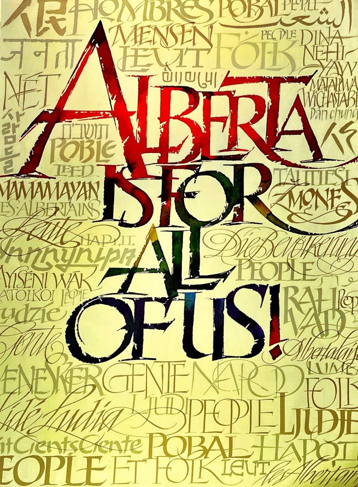
I started to apply this thinking to more brand-related assignments and illustrative commissions.
An illustrative field for Teradyne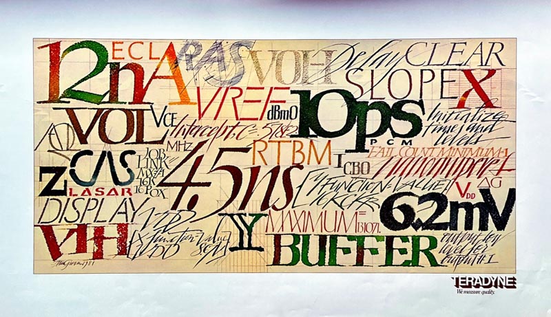
Seed Art for NK Syngenta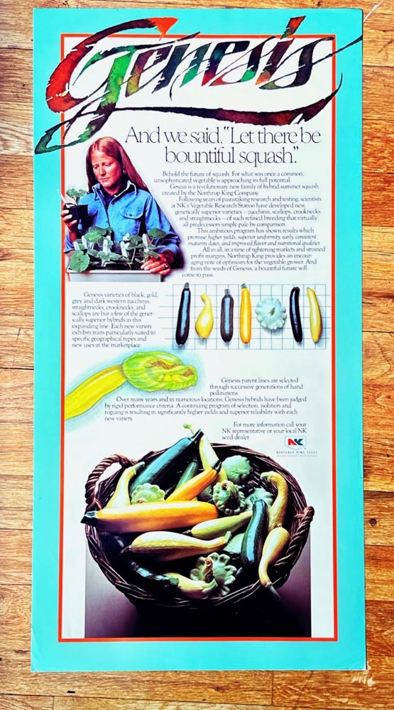
LIFE magazine spread, color-washed and designed
for Bob Ciano, CCO at TimeLife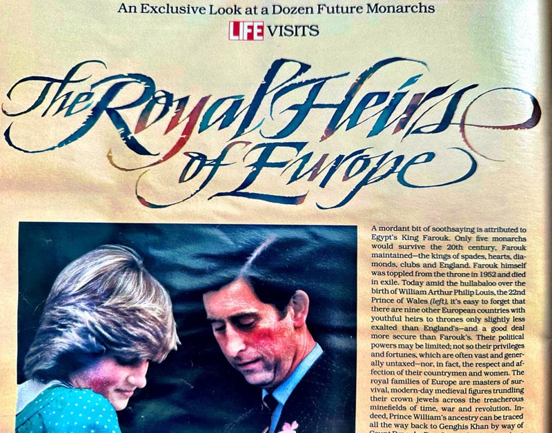
Editorial cover art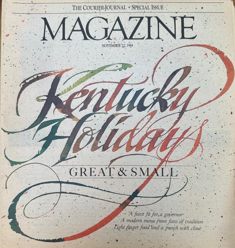
A Simpson Paper
C A L L for Entries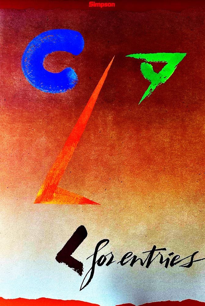
Simpson Design Designer and Paper Stock promotion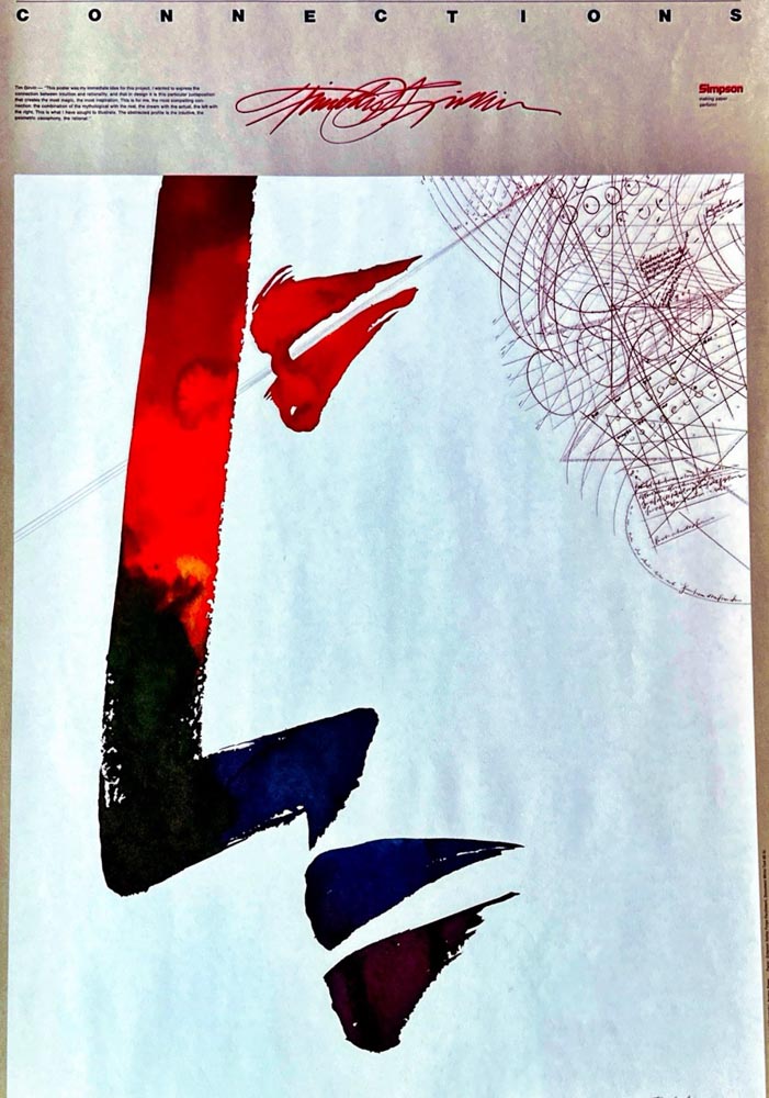
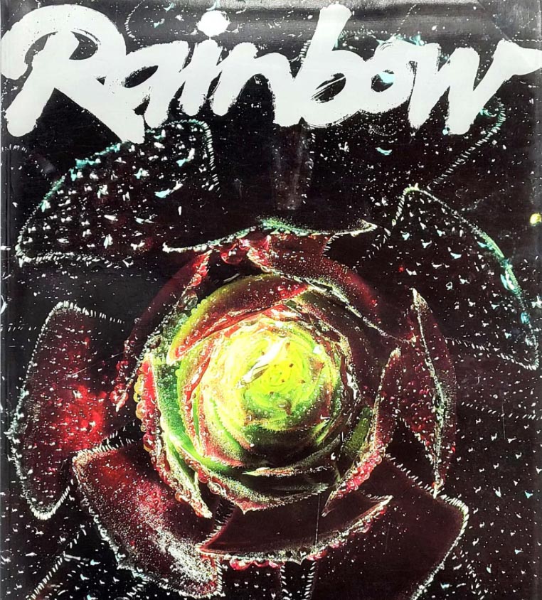
Perhaps the earliest exemplar of this watercolor technique—writing with water, not long after my European alphabetic craft journey, was a commission for
Rainbow magazine, in addition to designing the magazine’s masthead.
Collaborating with Robin and Heidi Rickabaugh, the outcome was the “Rainbow Garden of Herbs,” a composition of dozens of miniature, lettered calligraphies of plant names; each herb, was woven into an array of intermingled forms—here below,
Rainbow Magazine, 2’x 3′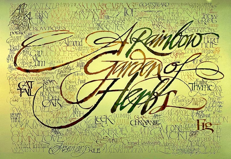
Interested in this exemplar, calligraphy and watercolored letter craft?
We can ship a print of this poster—from the original run for $45.00 plus shipping—numbered and signed at the date of its creation.
Reach-out to info@girvin.com
Tim
GIRVIN @West Queen Anne Elementary School
Digital: Strategic Magic | Built environments: Wave Theory